Central Standard Building
Located on the site where railroad leaders met in 1883 and established the U.S. time zones, ESI Design proposed changing the building name to Central Standard Building to honor its history and make wayfinding easier.

Central Standard Building, Chicago, IL
Experiential Graphic Designer, ESI Design
When we began renovation, the Central Standard Building had a dated, dark, sprawling, lobby with no clear sight lines. Most of the retail tenants had moved out. The repetitive floor patterns, low dark ceiling and prominence of dark wood along with the three separate street addresses, led to disorientation and an unwelcoming, tired feeling.
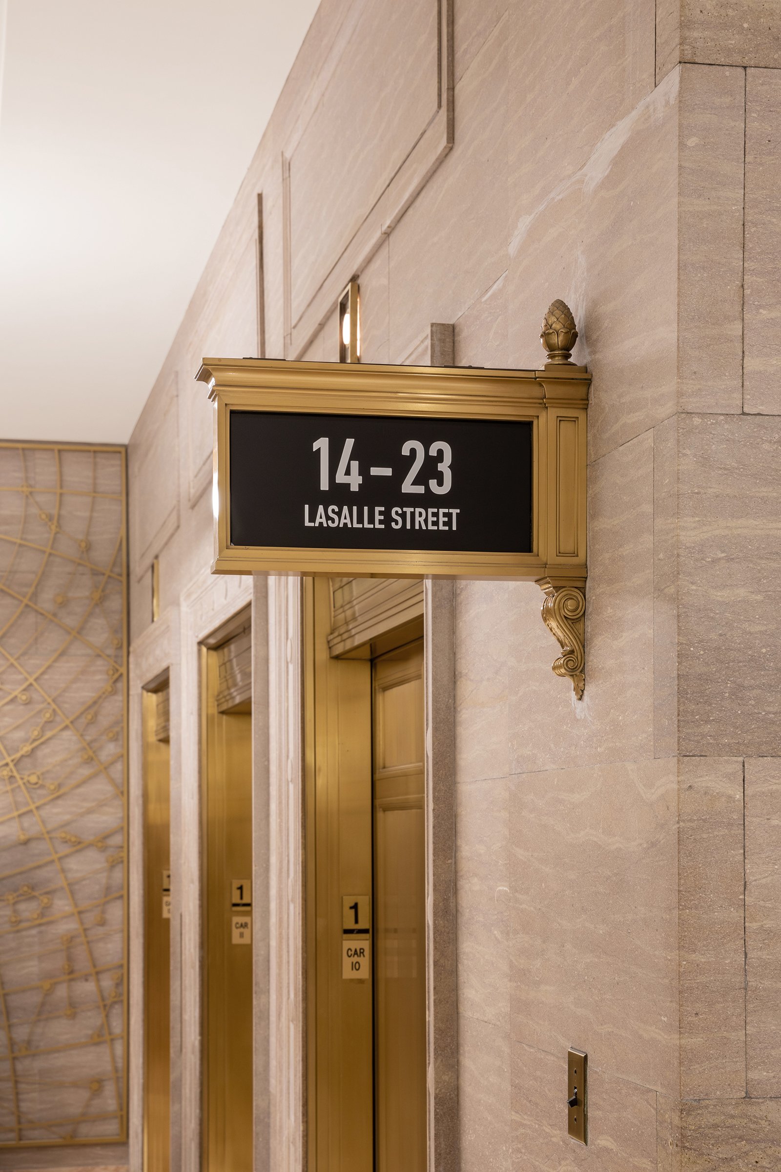
Celebrating the historic establishment of the time zones on the site, we renamed the property Central Standard Building and developed themes of time and travel with a focus on Chicago. These motifs are found in the bronze cut wall patterns of the elevator bays and the exterior corner-mounted building IDs.
The identity for the building complements the historic accents of the interior architecture in both style and material with a limited palette of white, black and bronze. This look and feel is seamlessly carried out throughout the vast space in environmental graphics, signage and wayfinding system, and tenant retail signage on the interior and exterior of the building.
Once the brand was established, I worked on a team with media, physical, and systems designers, to transform the interior into a bright, welcoming, reinvigorated space. While on the exterior, I developed an elegant system of environmental graphics to make the building standout, accentuate the three main entrances, and bring the retail tenant entrances to life.


